Data fun
In the last few years, infographics have gained a reputation for representing otherwise vague, confusing information in a way which communicates a message that anyone can grasp.
Handling information and data is part of mosts activists daily work: numbers, locations, words, photographs, on everything from water pollution to sexual harrassment. This data may sit in a spreadsheet and be pulled out and analysed and inserted into reports. But through a careful process of visualisation, data can tell a story, illuminate a complex issue, or suggest a solution.
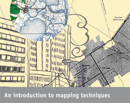
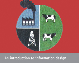
Our new project, Drawing by Numbers, intends to help activists understand how data visualisation can be used in campaigning and suggest some free online tools to get started. For people who are looking for more guidance on using data and evidence in campaigning, there are also a series of Data and Design How-To's. These articles include practical advice, examples and reflections from our own experience working with data visualisation and training activists on it. We will be releasing these articles over the coming months; read the first note now.
